|
|
|
|
|
|
|
|
|
|
||||||||
|
|
|
|
|||||
|
|
|
|
|
|
|||
As you create a visual program, you may have inputs whose values are subject to frequent change. You can use interactors as an easy method for controlling those input values. Interactors, which appear only in Control Panels, are the interactive devices that you use to manipulate inputs to a visual program in order to change the image that is produced (see "Using Interactors" for detailed descriptions).
Interactor stand-ins are used to indicate which input to a module a given interactor is to control. While you are building the network in the VPE, you select interactor stand-ins from the tool palettes and place them on the canvas, as you do with other tools. Like any tool, the output of an interactor stand-in can be connected to more than one input. Interactor stand-ins are named, in general, after the type of data they output:
Integer stand-ins | Represent interactors that output whole numbers. |
Scalar stand-ins | Represent interactors that output real numbers. |
String stand-ins | Represent interactors that output text strings. |
Value stand-ins | Represent interactors that output scalars, vectors, and tensors. |
Vector stand-ins | Represent interactors that output vectors. |
Integer list stand-ins | Represent interactors that output integer lists. |
Scalar list stand-ins | Represent interactors that output scalar lists. |
String list stand-ins | Represent interactors that output string lists. |
Value list stand-ins | Represent interactors that output value lists (e.g., vector and scalar lists). |
Vector list stand-ins | Represent interactors that output vector lists. |
Selector stand-ins | Represent interactors that output values and strings, representing a choice of one from many. |
Selector list stand-ins | Represent interactors that output values and strings, representing a choice of none, one, or more among many. |
FileSelector stand-ins | Represent interactors that output both a fully qualified path name and an individual file name. |
Reset stand-ins | Represent interactors that output one value when executed the first time after being set and another value thereafter. |
Toggle stand-ins | Represent interactors that output one of two values. |
Data Explorer allows the visual programmer to associate comments with each Control Panel. To access these comments, use the On Control Panel option of the Help pull-down menu in the Control Panel about which you want to learn. If no comments exist for the Control Panel, the On Control Panel option is grayed out.
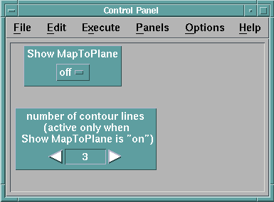
Figure 60 illustrates the organization of a Control Panel.
Figure 60. Control Panel
Window
You can create any number of Control Panels for one visual program, and you can also place a single interactor in multiple Control Panels. The configuration of a Control Panel and the values of the interactors are saved when you save the visual program. You can also customize Control Panels, and save or restore them independently of the visual program.
If you are going to control a tool input through an interactor in a Control Panel, then you must first connect an interactor stand-in to that input in the VPE. Using a stand-in as a tool input is an alternative to using the module's Configuration dialog box every time you want to change the value of the input.
To place interactors in a new Control Panel:
When a new Control Panel is created with the selected interactors, the interactors are placed in a vertical column in the order in which their stand-ins were placed on the VPE canvas.
Note: If you select a group that includes tools other than interactor stand-ins, only the interactors appear in the Control Panel. Therefore, the quickest way to place all the visual program's interactors in one Control Panel is to use the Select All option of the Edit pull-down, then select the New Control Panel option of the Windows pull-down menu.
To add an interactor to an existing Control Panel:
Alternatively, you can use "drag and drop" to add an interactor to an existing Control Panel:
You can add more than one interactor at a time to a Control Panel. To do this, select multiple interactor stand-ins on the VPE canvas, then select Add Selected Interactor(s) in the desired Control Panel. After doing this, you can use the mouse to place the interactors in the Control Panel one at a time. They are placed in the Control Panel in the same order that they were placed initially onto the VPE canvas. Similarly, you can drag and drop multiple stand-ins from the visual program to a Control Panel. You can also drag and drop interactors from one Control Panel to another, as long as both are associated with the same Data Explorer session. For more information on drag and drop, see "Moving and Copying Tools".
You can put the same interactor in more than one Control Panel and in the same Control Panel more than once. For example, you may want to have one Control Panel that contains all the interactors for a visual program, and another that contains only the most frequently used interactors. You can also place multiple instances of an interactor, with different styles or step size increments, in one Control Panel. This provides both coarse and fine control over a parameter value. The user interface ensures that each instance of the interactor is consistent. If you change a value in one instance, it changes in the others.
To select an interactor, click on it.
To select a group of interactors, use one of the following methods:
To deselect an interactor, shift-click on it.
To deselect a group of interactors, use one of these methods:
| Note: | Clicking on an empty part of the layout area deselects all selected interactors. |
To move a group of interactors:
To delete one or more interactors:
If you delete an interactor stand-in from the VPE, the interactor in the Control Panel is also deleted. However, deleting the interactor in the Control Panel does not affect what is displayed in the VPE.
You can change the size of interactors in a Control Panel. Some interactors (e.g., Selector) resize automatically, depending on their contents, but others (e.g., String) do not. You can resize any interactor by pressing the control key (Ctrl) and the left mouse button.
As you are building and modifying visual programs and Control Panels, you may find it desirable to locate that interactor in a Control Panel that corresponds to a specific interactor stand-in. To locate an interactor corresponding to a stand-in:
The interactor corresponding to the stand-in will become selected. If no interactors in the Control Panel are associated with the selected stand-in, the Show Selected Interactor(s) option will be grayed-out. If you have more than one Control Panel and you are unsure which of them contains the interactor corresponding to the stand-in, Step 2 (above) can be applied to each Control Panel. Alternatively, you can double-click on the stand-in. This will highlight the corresponding interactor.
To locate a stand-in corresponding to an interactor:
The stand-in corresponding to the interactor will be selected. If the stand-in is not in the currently displayed portion of the visual program, the display will be updated so the selected stand-in is visible.
To delete a Control Panel:
The Program Settings... option of the anchor window allows you to save your own configuration of the Control Panel(s) independently of the rest of the network. You can save the values of the Control Panels as well as the configuration of all of the stored Control Panels for the current visual program.
Select the Program Settings...Save As option on the File menu anchor window bar. You can retrieve Control Panels in the anchor window by using the Program Settings...Load option.
If you have made changes that you do not want to keep, click on the Program Settings...Load option of the File menu, and select the file again without saving. This procedure restores the original configuration.
This section describes the customization that can be done while building the Control Panel from the VPE window or while actually viewing the image in the Image window.
The Control Panel Options menu provides several possibilities for further customizing the Panel and its interactors, as described in "Control Panel Options Menu".
Every Control Panel is given the default name of "Control Panel," as shown in the title box across the top of the window. If you want to customize the name in any particular Control Panel, you can do so by clicking on the Change Control Panel Name... option on the Options menu and entering a new name in the dialog box that appears. The new name can contain any number of characters including any letter, number, symbol, or space that you find on the keyboard.
If you have several Control Panels in your visual program, you should assign names to them. Data Explorer allows you to open each one individually, by name, from a Control Panel, Image window, and VPE. To open a Control Panel by name from any of these three primary windows, do the following:
If other people are going to use the visual programs you create, it may be desirable to document how the interactors are used. You can associate comments with the Control Panel to describe how it uses the interactors to control input values in the visual program.
To add comments to a Control Panel:
These comments can be viewed, but not edited, by using the On Control Panel option of the Help pull-down menu in the Control Panel. To edit the comments, you must use the Comment... option of the Options pull-down menu.
You can specify whether the interactors you place in the Control Panel automatically align on a grid pattern. To do this, select Grid... from the Options pull-down menu. The Grid dialog box appears; it works the same way as it does in the VPE (see "Customizing the VPE Window").
A particular default interactor might not be the most desirable style for your particular application. For some interactor types, you can change this in a Control Panel at any time by using the following procedure:
Note: Be sure to highlight the interactor in the panel before selecting this option. Otherwise, most of the options will appear grayed-out. If the interactor is not a type whose style can be changed, the style option will remain grayed-out. A cascade menu appears for you to choose a new style.
You can change the size of the interactors in a Control Panel. Some interactors (e.g., Selector) resize automatically; others (e.g., String) do not. To resize any interactor, press the Control key and then drag the border of the interactor.
When vector and vector list interactors are created, by default, their dimensionality to set to 3. Dimensionality can be changed using the Edit menu Set Dimensionality option.
When an interactor is created, its layout is vertical, that is, the interactor label is placed at the top of the interactor. Data Explorer allows you to choose between this vertical layout and a horizontal layout. The horizontal layout places the label on the left side of interactor.
To change the layout of the interactor:
You can have several instances of the same interactor. Each instance can be a different style (stepper, dial, or slider) and can have a different increment value. However, all instances of an interactor have the same value and the same minimum and maximum limits. As you change the value or range of one instance, the other instances of that interactor are automatically updated.
To change the range of values of an interactor, select the interactor, and select the Set Attributes... option in the Edit menu; or double-click on the interactor in the Control Panel. The Set Attributes... dialog box (Figure 61) appears.
Figure 61. Set
Attributes Dialog Box
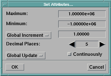
Note: Many interactor types can also be data-driven, meaning that their attributes are derived at run time from data in the visual program. See "Using Data-Driven Interactors".
To assign common attributes to all components of a vector interactor, set the option box at the top of the dialog box to All Components. When you do this, the component stepper is disabled, and any attributes you set are applied to all components of the vector.
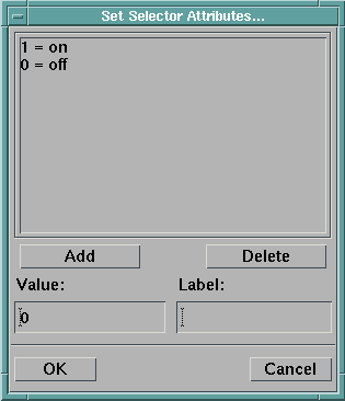
The Selector and SelectorList interactors are similar to an option menu, with the current choice(s) displayed by the interactor. (The Selector offers a one-of-many choice; the SelectorList, a choice of none, one, or more among many.) Each choice on the interactor represents a pair of outputs: a value and a string. The string is what appears as the choice on the interactor. The value can be a string, integer, scalar, vector or matrix. All the values must be of the same type. By default, the values are integers. A value is associated with a string using the Set Attributes... dialog box (Figure 62).
Figure 62. Set
Attributes Dialog Box for a Selector Interactor
You can use the Selector or SelectorList interactor for many purposes. A common use is as a switch control in your visual program. You can use an integer output, for example, as input to the Switch module to switch easily among several objects. You can use a string output, for example, as input to the Select or Import modules, allowing you to easily select different members or data file names. You can also use a string output as input to the Caption module to annotate the image with the current selector setting. A discussion on how to use the Selector and SelectorList interactors can be found in "Selector and SelectorList Interactors".
The default choices for the Selector and SelectorList interactors are:
| Note: | If you wish to change the type of the values in the value field, for example, entering values other than integers when initially configuring the interactor, you must first delete all the entries in the Set Attributes... dialog before entering new ones. This is required since the type of all values must be the same. |
Because the selector interactor yields both the value and the string as outputs, you can use either output, or both, in a visual program. In the selector stand-in, the output on the left is the value, while the output on the right represents the string.
The default label on any unconnected interactor is the name of the interactor stand-in. If the interactor is connected to one input, the default name of the interactor is the name of the tool followed by the input parameter name. If the interactor is connected to more than one input, its default name is the name of the interactor stand-in. You can change the default name by doing the following:
Figure 63. Set
Interactor Label Dialog Box
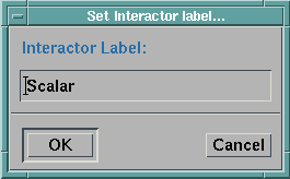
The new name can contain any number of characters, including any letter, number, symbol, or space that you find on the keyboard. (If you want a blank label, enter "\0" for the name.)
The interactor label can have multiple lines: type "\n" where you want a line to break. For example,
First Line\nSecond Line
You can set the output of Toggle and Reset interactors for both their "button down" (set) and "button up" (unset) states.. The output value can be string, integer, scalar, or vector, and the set and unset outputs do not have to be of the same type.
It is possible to customize Control Panels so that they appear as dialog boxes. This is intended for building applications to be used in -image or -menubar mode (i.e., with the Image window or menu bar as the anchor window). The appearance of the dialog box can be modified with the options Label and Separator under Add Element in the Edit pull-down menu of the Control Panel. These will add the specified element to the panel at the point where the mouse cursor is positioned. Separators can be made vertical using the Set Layout option of the Edit menu. The size of the separator can be controlled using the mechanism described in "Resizable Interactors.". The color and font of labels can be specified using the dialog box that appears when the label is created. These can be changed by selecting the label and choosing Set Attributes from the Edit menu of the Control Panel.
Once the Control Panel has been created, select Dialog Style in the Options pull-down menu to create the dialog box. The size of the box will vary to accommodate the interactors. The empty canvas to the right of the interactors will be truncated. The placement of the interactors will also change if the box size is changed, to maintain the same relative positions. In -editor mode, the Close button returns to an editable Control Panel. In -image or -menubar mode the, Close button closes the dialog box. To enable a "dialog style" dialog box, save the visual program with the Control Panel in dialog-style format.
You may wish to organize your Control Panels into groups or hierarchies depending on how the interactors in the Control Panels relate. For example, you may have a few Control Panels that are tightly related and wish to have them treated as a group. Data Explorer provides you with the means of placing these Control Panels into a group so that they can be opened together.
If you have a master Control Panel that should be open before any other controls, Data Explorer provides you with the capability of restricting access to these Control Panels from any Data Explorer window except the master Control Panel. Access to Control Panel groups can be done in a similar fashion. Restricting access to Control Panels in this way allows you to build Control Panels into hierarchical structures.
A special type of Control Panel access can be achieved by specifying which Control Panels are automatically opened when Data Explorer is started with the Image window or menu bar as the anchor (using the -image or -menubar option).
The following describes how to create Control Panel groups, restrict access (build hierarchies), and specify which Control Panels are open at startup.
Control panel groups are created using the Control Panel Group... dialog box. The dialog box is opened by selecting the Control Panel Groups... option under the Options menu in the VPE window (Figure 64).
Figure 64. Control
Panel Group Dialog Box
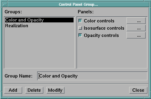
The right side of the dialog displays the list of Control Panels. Associated with each Control Panel is a toggle button to the left and an ellipsis toggle to the right. The left side of the dialog is a list of the existing groups. This list remains empty until a group is created. At the bottom of the dialog box is a series of pushbuttons that are used for creating, modifying, and deleting groups. Clicking on the ellipsis causes the corresponding Control Panel to be opened (or raised to the front if it is already opened). Clicking on the ellipsis when it is depressed closes the corresponding Control Panel and releases the toggle.
To create a Control Panel group:
The new group is added to the list of groups displayed on the left side of the dialog box. The group is also added to the list of named Control Panels that is displayed by the Open Control Panel by Name option in the Windows menu.
Once a Control Panel group is created, it can be modified. Modifying a Control Panel group can include changing its name, adding new Control Panels, and removing Control Panels from the group.
To modify a Control Panel group:
To delete a Control Panel group:
Access to Control Panels is restricted using the Control Panel Access... dialog box. This dialog box is opened by selecting the Control Panel Access in the Option menu of the VPE, Image, or Control Panel windows. The Control Panel Access dialog is used to restrict certain Control Panel names or Control Panel groups names from appearing in the Open Control Panel by Name option in the Windows window.
A Control Panel Access dialog box appears in Figure 65.
Figure 65. Control
Panel Access Dialog Box
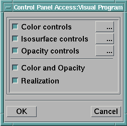
To restrict Control Panel access:
Selecting the Cancel pushbutton causes the dialog box to be closed and any changes to be canceled.
Data Explorer allows you to choose whether a Control Panel opens automatically when you start the system with the Image window or menu bar as the anchor (using the -image or -menubar option). Using this option, you can have the appropriate Control Panels be immediately available to a user running your visual program. The Startup Control Panel option in the Options pull-down menu is a toggle button, and is toggled on by default. If you do not want a particular Control Panel to open automatically, toggle the option off by clicking on it in that Control Panel.
The automatic startup feature can be suppressed by using the -suppress startup flag when you run Data Explorer. See C.2 , "Command Line Options" for more information.
You can open existing Control Panels associated with a visual program in the following ways:
Alternatively, you can select one or more interactor stand-ins in the VPE, then choose Open Control Panel from the Windows menu in the VPE. All Control Panels associated with the selected interactors are opened.
When Data Explorer is started with the Image window or menu bar as the anchor window, some Control Panels may be opened automatically as a visual program is loaded. For visual programs you create, you can decide whether a Control Panel should open automatically (see "Specifying a Startup Control Panel").
You use interactors to dynamically change the inputs of a tool without making modifications in the VPE window. Interactors reside in Control Panel windows. As a visual program is built in the Editor window, the user selects the interactor stand-ins from the Tool Palettes and places them on the canvas. Then the corresponding interactors are placed into existing Control Panels or into a new Control Panel, as described in "Building Control Panels". Different interactor stand-ins can be represented by different interactor styles.
Integer and scalar interactor stand-ins can be represented by four styles:
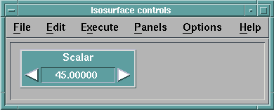
The Stepper (Figure 66) enables you to enter a value by typing it into the text field or by using the arrow buttons to increase (right arrow) or decrease (left arrow) a displayed value. The arrow buttons have a built-in acceleration function so that the longer you depress a button, the faster the value changes.
The Dial (Figure 67) has circular shape. You can specify a value by manipulating the dial indicator, or you can directly enter a value in the field at the bottom of the interactor.
To manipulate the dial indicator, press and hold the mouse button in the circular part of the interactor. Turning the dial clockwise increases the interactor value, while turning it counterclockwise decreases the value. If you move the cursor within the dial, shading occurs in intervals around the dial indicator. The shading indicates whether the value change is positive or negative. The shading is light if you move in a clockwise direction (positive); it is dark (negative) if the movement is counterclockwise. If you click the pointer within the shaded area, the dial indicator jumps to the mouse pointer location, and the value changes accordingly.
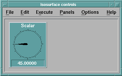
The dial indicator can move clockwise or counterclockwise as many times as determined by the increment values and minimum and maximum that are set. These limits can be set in the Set Attributes dialog box, which you can display by selecting the Set Attributes... option on the Options menu. When the interactor reaches the limit, it can no longer be turned in that direction.
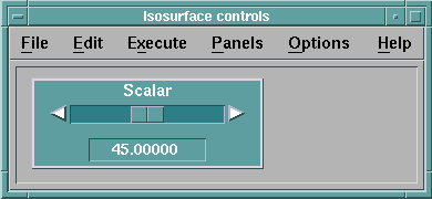
The Slider (Figure 68) enables you to enter a value by either moving the tab on the Slider, typing in a number, or clicking on one of the arrow buttons to increase (right arrow) or decrease (left arrow) a displayed value.
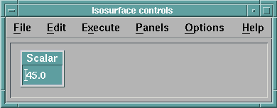
The Text style (Figure 69) enables you to simply type in a value. For more information on how to enter and modify text in a field, see "Editing Text Fields".
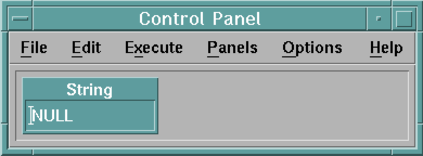
The string stand-in has one style of interactor, which cannot be changed. This interactor consists of a text field (Figure 70). (For information on how to enter and modify text in a text field, see "Editing Text Fields".) It enables you to enter strings by typing directly into the text field, then pressing the Enter key.
The value stand-in has one style of interactor that cannot be changed. This interactor consists of a text field. (For information on how to enter and modify text in a text field, see "Editing Text Fields".) This interactor enables you to enter scalars, vectors, and lists by typing directly into the text field and pressing the Enter key. The input into the text field must either begin with a numeric value, or be enclosed by brackets ([ ]) for vectors. See "Vectors, Matrices, and Tensors" and "Lists" for more information on the syntax of vectors and lists.
The vector stand-in has two styles of interactor; a stepper style and a text style. The Vector interactor works like one, two, or three Steppers stacked in a column. With it, you can specify the components of a vector (e.g, x, y, and z) from top to bottom. See "Stepper" for detailed information on the operation of a Stepper. You can also change the dimensionality of the interactor using the Edit menu Set Dimensionality option. The text style vector interactor is similar to that of the value interactor.
With the exception of Selector, these list interactors can have two styles: list-editor and text. The text-style list interactor is similar to that of the value interactor.
The list-editor style list interactors consist of the following parts:
Figure 71. Sample
Vector List Interactor
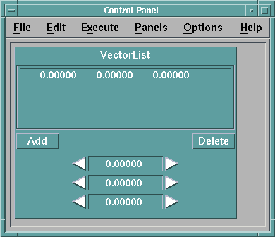
The top portion of the list interactor shows the current list of values. If the list exceeds the length of the display area, a vertical scroll bar is provided. If the list values exceed the width of the display, a horizontal scroll bar is provided.
To modify an element, select it by clicking on it. The stepper or text field is updated to show the element's values. Use the stepper or text field to change the values of the elements.
To append a value to a list, make sure that no list elements are selected. (An element can be deselected by clicking on it.) Use the steppers or text field at the bottom of the interactor to specify the value, then click on the Add button.
To add an element to the middle of the list, select the element following the position you want the new value to occupy. Click on the Add button. A copy of the selected element is added to the list, becomes selected, and the steppers or text field display its current value. Use the steppers or text field to adjust the value of the new element.
To delete an element from the list, select it by clicking on it, then click on the Delete button. After deleting the item, the next item in the list becomes selected.
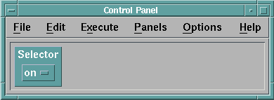
The Selector interactor (Figure 72.) can be used as a switch control in a visual program. It can appear as an option menu (with only the current choice shown) or as a "radio button" interactor, with all possible choices shown, and only the current choice highlighted in the radio button next to the label. The SelectorList interactor always appears as a list of toggle buttons.
Figure 72. Selector
Interactor (Radio-button Style)
"Setting Selector and SelectorList Interactor Attributes" describes how to configure the selector interactor for your visual program, and also describes its various uses.
The FileSelector interactor can be used to select a file from within the file system (Figure 73).
Figure 73.
FileSelector Interactor
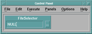
The interactor consists of a text field containing a string and a button labelled with an ellipses. Clicking on the button causes a file selection dialog box to be opened. The file selection dialog box, illustrated in Figure 74, functions in a similar manner to other file selection dialog boxes (for a description on how to use file selection dialog boxes see "Saving and Restoring a Visual Program") with the exception of the buttons at the bottom of the dialog box.
Figure 74. File
Selection Dialog Box
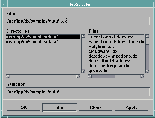
OK causes the file name in the Selection area to be set in the text field of the FileSelector interactor and closes the file selection dialog box. Filter applies the filter string specified in the Filter area. Close closes the file selection dialog box without any modification to the FileSelector interactor text field. Apply causes the file name in the Selection area to be set in the text field of the FileSelector interactor and leaves the file selection dialog box open.
An alternate way of specifying or modifying a file name in the FileSelector text field is to directly type into the field. See "Editing Text Fields" on how to enter and modify text in a text field.
The FileSelector interactor produces two outputs: the first output is the contents of the text field (typically a fully qualified path name set from the file selection dialog box). The second output is the name of the file as it appears in the directory (that is, excluding any directory name).
The Toggle interactor outputs one of two possible values. The values can be strings, scalars, vectors, or matrices. This interactor appears only as a toggle button.
Most of the interactor types may be data-driven, meaning that their attributes, such as minimum, maximum, increment, and label, may be set by connecting the output of a tool to the input of the interactor stand-in in the VPE or by a value typed into the interactor stand-in's Configuration dialog box, rather than by using the Set Attributes dialog box for the interactor.
If an interactor is data-driven, then the information transmitted via connections or set in the Configuration dialog box overrides the values set via the Set Attributes dialog box and causes the corresponding values in the Set Attributes dialog box to be grayed out.
Data-driven interactors allow you to create visual programs that will work with a variety of input data sets without the need to reset the interactor attributes to be in a range appropriate for the data being used. For example, a scalar interactor controlling an isosurface value can be data-driven by connecting the input data field to it. The interactor is then automatically set so that its minimum and maximum span the range of the data.
Data-driven interactors have a data input to which an input data field may be connected. In this case the interactor automatically chooses the minimum, maximum, and increment. However, if you would like to have more control over the exact values that are used, the interactors allow you to specify them directly through other input tabs that are by default hidden. For example, you may wish to set the minimum and maximum for an interactor to go from the minimum of the data values to the midpoint of the data values, rather than to the maximum. In this case, you can use the "min" and "max" input tabs of the interactor rather than the "data" tab.
The interactors that can be data-driven are Integer, Scalar, Vector, IntegerList, ScalarList, VectorList, Selector, SelectorList, and Toggle. In Chapter 2. Functional Modules in IBM Visualization Data Explorer User's Reference, the inputs for each of these interactors are described on the manual page corresponding to that interactor.
Each time an input to a data-driven interactor is changed (for example, by importing a new data set) the interactor is reexecuted, updating its attributes. If the current setting of the interactor lies within the new range allowed, the interactor value does not change. If the current setting is outside the new allowed range, the current setting is reset to the midpoint of the new minimum and maximum.
[ OpenDX Home at IBM | OpenDX.org ]