2.5 Controlling the Appearance of an Object: The Image Window
Controlling the appearance of an object means being able to control
various aspects of its visual image on the screen as well as the
data used in generating that image.
This section deals briefly with control of the following aspects:
- the object's appearance (size and the "view" displayed in
the Image window)
- the sequence in which object images are presented
- the input from which an object's image is generated
- the color(s) of an object
- the placement of axes around an object.
Note: Throughout this document, the term "Image window" refers to
the window generated by Image (not by Display).
Both of these modules are described in IBM Visualization Data Explorer
User's Reference.
Also see IBM Visualization Data Explorer User's Guide for a
comprehensive treatment of the user
interface.
Size, View, and AutoAxes
In Data Explorer the most easily controlled feature of an object in the Image
window is its size, which can be changed by direct manipulation
of the window.
Other important features of its appearance are controlled through two
options in the Options pull-down menu in the Image
window menu bar: View Control and
AutoAxes.
Size Control
To change the size of an image, simply change the size of the Image
window.
Holding down the left mouse button:
- Drag a horizontal border to shrink or expand the window
vertically.
- Drag a vertical border to shrink or expand the window
horizontally.
- Drag a corner to shrink or expand a window vertically and
horizontally.
Notes:
- Reset in the Options
pull-down menu restores the original view of the
object but not the original size of the window.
- If your visual program uses the Display rather than the Image tool,
the image size can be changed only by changing the resolution
parameter of Camera or AutoCamera (see Camera and
AutoCamera in IBM Visualization Data
Explorer User's Reference for descriptions of these tools.)
View Control
The View Control dialog box allows you to control
(among other aspects of an object) the following:
- Viewing direction
- Rotation
- Field of view (zooming and panning).
To open this dialog box, select View Control...
in the Options pull-down menu in the
Image window.
Controlling the Viewing Direction
To change the viewing direction, select Set View
in the dialog box (see Figure 6).
The list of choices that appears includes 7 directional views of the
object (Top, Bottom, etc.).
Because these "head on" views show only "one side" of an
object (tending to flatten its appearance), the list also
offers 7 corresponding "off" views (Off Top, Off
Bottom, etc.).
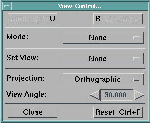
Figure 6. View Control
Dialog Box. This dialog box is activated from the Options pull-down menu
of the Image window (see Figure 5).
When you select a view of an object, the image is automatically
altered (note the highlighted Execute in the
menu bar).
Controlling Rotation
To rotate an object in the Image window, first click on the
Mode option box (initially displaying
None) and then select
Rotate from the
displayed list.
Rotate becomes the current mode and a set of axes
appears in the lower right-hand corner of the window.
You can rotate the object in two dimensions (clockwise and
counterclockwise) or in three by rotating the
axes.
You can also cause the object to rotate "continuously" (i.e.,
in coordination with the axes).
2-D Rotation
| Position the mouse cursor in the Image window and hold down the
right mouse button:
clockwise movement of the mouse produces clockwise rotation of the
axes; counterclockwise movement produces
counterclockwise rotation.
When the mouse button is released, the object rotates by the
same amount as the axes have, assuming the same relative position
in the window.
|
3-D Rotation
| Position the mouse cursor in the Image window and hold down the
left mouse button: the mouse now behaves like a
track ball and the axes move accordingly.
When the mouse button is released, the object rotates by the same
amount as the axes have, assuming the same relative position
in the window.
|
Continuous Rotation
| Once you have selected Rotate mode,
you can
make the object rotate along with the axes:
select Execute in the menu bar and then
Execute on
Change in the pull-down menu (Execute is
highlighted).
The image is now replaced by a dot representation of the object (see
rendering options in IBM Visualization Data Explorer User's Guide).
The movement of the mouse (and the axes) is reflected directly and
continuously in the movement of this dot version.
Note: Movement of the axes is essentially synchronous with movement of
the mouse, but the "response time" of the dot version may vary,
depending on the machine and configuration.
|
Notes:
- Turn off Execute on Change by selecting
End Execution in the
Execute
pull-down menu.
- To restore the original view of the object, select
Reset in the
View Control
dialog box.
Controlling the Field of View
Zoom mode allows you to enlarge an object, making it
appear
closer (zooming in) or to reduce it, making it appear more distant
(zooming out).
Pan/Zoom mode allows you to change the center of
focus while zooming in or out.
Zooming in:
- Select Zoom in the Mode
option list of the dialog box.
- To zoom in, position the mouse cursor in the Image window and
hold down the left mouse button.
An overlay rectangle appears.
- You can enlarge or shrink this rectangle by moving the mouse
cursor away from or toward the center of the window.
- When you release the mouse button, the area of the rectangle expands
to fill the Image window, making the object appear nearer.
Note: If you simply click the mouse button instead of holding it down,
the overlay rectangle will disappear before you can
change its dimensions.
The modified image of the object will be based on that rectangle.
(The size of the rectangle and thus the degree of "zoom" depends
on the distance of the cursor from the center of the window when
you first press the mouse button.)
- To cancel the effect of the most recent command, select
Undo in the dialog box or in the
Options pull-down menu.
You can also repeat a command that has been "undone," by selecting
Redo.
Note: Since executed commands are maintained in a stack, you can undo
those commands one by one and redo them, too.
- Reset in the dialog box (or in the
Options pull-down) menu restores the
original view: (e.g., front) of the
object.
Zooming out:
- Follow the procedure described for zooming in, but use the
right mouse button.
- When you release the mouse button, the area of the Image window is
reduced to the area of the rectangle, making the object
appear more "distant".
Panning and Zooming out:
- Select Pan/Zoom in the
Mode
option list of the dialog box.
- Position the mouse cursor at the point in the Image window that
you want as the center of the new "picture," and press the
appropriate mouse button (left to zoom in or right to
zoom out).
- Move the mouse in any direction to display the overlay
rectangle.
The "zooming" behavior of the object with respect to the rectangle
will be the same as that just described.
- To restore the original view of the object, select
Reset in the dialog box.
- Leave the View Control dialog box open for the
next exercise.
AutoAxes Configuration
The AutoAxes Configuration dialog box allows you to
generate a set of axes for an object in the Image window and to
specify some of its characteristics.
- Click on Options in the menu bar of the Image
window and then select AutoAxes in the
pull-down menu.
The AutoAxes Configuration dialog box appears.
Note: To display additional options, click on the
Expand button at the
bottom of the dialog box.
For purposes of this tutorial, you will not be changing any
AutoAxes options.
For more information, see AutoAxes in
IBM Visualization Data Explorer User's Reference.
- Click on the Enabled toggle button (at the top
of the dialog box) to select the AutoAxes option.
The button is now activated.
- Click on OK or Apply
at
the bottom of the dialog box to confirm the selection.
Notes:
- OK closes the dialog box;
Apply does not.
- Selection of Enabled and
OK
or Apply is necessary but not sufficient to
activate the AutoAxes option (see next step).
- Select Execute in the menu bar and then
Execute Once in the pull-down menu.
The object now appears in an axes box.
Because the view is "head on," the box appears to be
2-dimensional.
For Diagonal or any of the "Off" views,
however, it appears fully 3-dimensional (see next step).
- To change the view of the object, select another (e.g.,
Diagonal) from the Set View
pull-down list in the View Control...
dialog box.
The view changes to Diagonal (note that the axes
box changes as well).
- To remove the axes box from the window:
- Deactivate the Enabled toggle button in the
AutoAxes Configuration dialog box by
clicking on it.
- Click on OK or Apply.
- Again, execute the program (unless it is already in
Execute on Change mode).
The axes box disappears.
- To restore the original view of the object, click on
Reset in the View
Control dialog box
- Close the View Control dialog box (by clicking
on Close) and the AutoAxes
Configuration dialog box (by clicking on
Cancel).
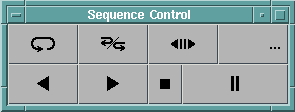
Figure 7. Sequence
Control Panel. The first two buttons at top left are Loop and
Palindrome. The others are: Step (<||>), Counter
(...), Back (<), Forward (>), Stop (&sqbul;),
and Pause (||).
Using the Sequencer
The Sequencer allows you to "animate" a visual image and is very
easy to use.
The process is rather like running a video cassette tape:
You can play it forward or backward, stop it, pause, and so on.
(If you look at the canvas of the VPE window, you will see that the
Sequencer is one of the components of the example1.net
network.)
- Click on Execute in the menu bar of the Image
window and then on Sequencer in the pull-down
menu to display the Sequence Control panel
(Figure 7).
- Click on the Forward button (>) to start the animation
sequence.
Note: A Sequencer button appears recessed when it is activated.
As the sequence proceeds, the Counter button
(...) displays the
corresponding "frame" number.
At the end of the execution cycle, the window displays the final image
in the sequence, the Counter displays the final frame
number, and the Forward button is
deactivated (not recessed).
- Click on the Back button (<) to run the same sequence
in reverse.
At the end of the execution cycle, the window displays the original
image, the Counter displays "0", and the Back
button is deactivated.
- Click on the Step button (<||>) to
activate it.
You can now proceed through a sequence frame by frame in either
direction, using Back and Forward.
Note: In Step mode, the Back and Forward buttons appear as
<|| and ||>
respectively.
- Click on Step again (to deactivate it) and then on the Loop button
at the top left (marked by a single "looped" arrow).
Now, if you click on Back or Forward, the sequence will repeat itself
until you interrupt it (see the next four steps).
- Click on the Pause button (||) to suspend
the sequence.
- Continue the sequence from this point or reverse it, using
Back or Forward.
- Click on the Stop button (&sqbul;).
The sequence halts (the Loop button remains activated).
Note: The Stop button does not affect the status of the Loop,
Palindrome, or Step button.
- Click on Back or Forward.
A new sequence starts again from the beginning (i.e., a "stopped"
sequence cannot be continued or reversed from the point at
which you interrupted it).
- Click on Loop.
The sequence continues to its end before stopping and the Loop button
is deactivated (compare with the Stop button).
- Click on the Palindrome button (between Loop and Step).
With this option activated, you can use the Back (or Forward) button to
run a sequence through one back-and-forth cycle (from first frame
to last and back to first, or vice versa).
Note that if you activate this function at some intermediate frame in
the sequence, only the remainder of the cycle
is executed.
- To restore the original view of the object, click on
Reset in the View
Control dialog box.
- Close the Sequence Control panel (double click on the window menu
button in top left corner of the frame).
| For Future
Reference |
|---|
|
You can activate both the Loop and Palindrome buttons together.
The back-and-forth cycle will repeat itself until you deactivate one
them or click on the Stop button.
|
Using Control Panels
Control panels give you direct control of inputs to a
visual program.
The control panel included with example1.net, for
example, allows you to incorporate a colored plane in the image
of an object and to decide the number of contour lines to be
displayed in that plane.
To open the control panel:
- Select Windows in the menu bar of the Image
window.
- Select Open All Control Panels in the pull-down
menu.
The control panel appears (see Figure 8).
Figure 8. Control Panel
with two Interactors..
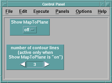
To display a colored plane:
- Click on off in the Show MapToPlane
interactor.
- Select on when it appears in the selection
list.
- Select Execute in the menu bar of either the
control panel or the Image window.
- Select Execute on Change in the
pull-down menu.
The visual program reexecutes and the colored plane is incorporated
as part of the current image.
- To specify the number of contour lines, click on one of the two
stepper arrowheads in the number of contour lines
interactor (right to increase the number, left to
decrease it).
Since Data Explorer is in Execute on Change mode, the
number of contours changes when the number in the
interactor changes.
Notes:
- The second interactor has no effect if the first
interactor is off.
- Depending on opacity and other factors, some of the contour
lines "inside" the object may not be visible.
- Click on on in the Show MapToPlane interactor
and then select off when
it appears.
The plane disappears and the original image is restored.
Using the Colormap Editor
The example1.net visual program includes a Colormap
Editor for controlling the color characteristics of data values
represented in the visual image.
The editor also controls the opacity of those values
(see Table 1).
Opening the Colormap Editor:
- Select Open All Colormap Editors in the
Windows pull-down menu of the
Image window.
Now changes made in the Colormap Editor (Figure 9) will
be reflected both in the editor and in the image.
(Data Explorer should still be in Execute on Change
mode
from the preceding exercise.
If not, select that mode in any Execute pull-down
menu.)
For example:
- Move the mouse cursor into the large rectangle under the
Hue label button (the cursor changes
from an arrow to a circle with sight marks).
- Use the left mouse button to drag the control point
(the small box in the upper left-hand corner of the rectangle)
horizontally to a position under Hue.
The color column to the left changes as the point moves.
Note: The Hue button is automatically
activated
when the mouse button is pressed with the cursor positioned
in the Hue rectangle.
- Release the mouse button.
Color changes appear in the object.
- Drag the control point back to its original position and release
the mouse button.
The color column and the object return to their original states.
Table 1. Image
Characteristics Controlled by the Colormap Editor
| Characteristic
| Description
| Numerical Range/
Image Values
|
| Hue
| A particular color
| 0.000 = Red
0.333 = Green
0.666 = Blue
1.000 = Red
|
| Saturation
| Purity of color
| 0.0 = White (all colors)
0.5 = "Pastel" (50% of one color)
1.0 = Pure (100% of one color)
|
| Value
| Degree of brightness
| 0.0 = Black (0% brightness)
0.5 = Dark (50% brightness)
1.0 = Maximum (100% brightness)
|
| Opacity
| Degree of transparency
| 0.0 = 0% Opaque (100%
transparent)
0.5 = Semi-opaque (50% transparent)
1.0 = 100% Opaque (0% transparent)
|
| The numerical range used in specifying
discrete values of a
characteristic is 0.0-1.0.
Corresponding Colormap values at the limits and middle of a range are
also listed.
|
Before going any further, you should familiarize yourself briefly with
the Colormap Editor (Figure 9).
Note that the four labeled rectangles to the right correspond to the
characteristics listed in Table 1.
In each rectangle, at least two control points (very small "boxes")
and a line connecting them determine how the image characteristics
associated with a particular data value are represented in
the image (the figure shows the default settings).
Changes in the position of a control point are reflected directly in the
two left-hand columns of the editor and (in Execute on
Change mode) in the Image window.
The "data range" from the bottom to the top of the color column is
the
range of actual data values for which image characteristics
(e.g., hue) can be specified.
Specifying Colormap Values
You can specify a Colormap value in two ways:
- Directly by manipulating a control point.
- Indirectly through the Add Control Points
dialog box.
The first is quick and approximate.
The second is slower and precise.
Figure 9. Colormap
Editor for .../example1.net. The four image characteristics controlled
by the editor (hue, saturation, value, and opacity) are also listed in Table 1. The numerical range for each is 0.0-1.0. For
Hue this range is "r g b r" (red green blue red); the
current setting corresponds to the red-green-blue spectrum of the color column
to the left. The column furthest left (RGB) displays the red-green-blue color
values corresponding to the four settings on the right. Note that each setting
is determined by a "line" whose position can be changed by moving the "control
point" at one of its ends; the shape of the line can be modified by adding
control points (see text). The values 0.0 and 2.5000000 are the minimum and
maximum of the data values used in the visual program.
Specifying approximate values:
- Position the mouse cursor in the middle of the large
Value rectangle and
double click the left
mouse button.
Note the changes that result:
- A new control point appears (turning the vertical line into two
line segments) and the Value button is
activated.
- The data value of the new point is displayed in the data range next
to the color column (the RGB area, color column, and image show
corresponding changes).
- To move the control point, use the left mouse button to drag it.
The RGB area, color column, data value, and image all change
accordingly.
- To return Value to its previous state, double click on the
control point.
Specifying exact values:
- Select Edit in the menu bar of the Colormap
Editor and then select Add Control Points
in the pull-down menu.
A dialog box appears (see Figure 10).
Figure 10. Add
Control Points Dialog Box. This dialog box has two interactors: The
first specifies the actual data value for which a corresponding set of Colormap
values are to be implemented. The second specifies one of the four Colormap
values, such as Hue in this example (see text).
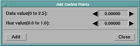
- Click on the Saturation rectangle of the
Colormap Editor.
The label button in the editor is activated (recessed) and the new
interactor label in the Add Control Points
dialog box changes to "Saturation value
(0.0 to 1.0)."
- Click on the data value displayed in the dialog box, type in the
value 1, and press
Enter.
The new value is displayed as 1.00000.
- Click on the saturation value displayed in the dialog box, type in
the value .28, and press
Enter.
The new value is displayed as 0.28000.
- Click on Add in the dialog box:
A control point corresponding to the new values in the dialog box
appears in the Saturation rectangle of
the editor.
The RGB area, color column, and image all change accordingly.
Now that you know how to open and execute visual programs and to
control the images they generate, you can proceed to
Tutorial II, which deals with various techniques
for visualizing data.
| Additional Notes on Control
Points |
|---|
|
Displaying Control Point Values
By default the Colormap Editor displays the values of all
control points.
To display the value of an individual point:
- Select in order:
- Options in the menu bar of the ColorMap Editor
- Display Control Point Data Value in the
pull-down menu
- Selected in the pull-down list.
- Click on the desired control point in the ColorMap Editor (the
rectangle containing the control point is automatically
activated if it is not already activated).
The data value corresponding to the selected control point appears
in the data range next to the color column.
- Repeat the preceding selection procedure, except click on
All in the pull-down list (instead of
Selected).
Data values for all control points in the activated
rectangle now appear in the data range.
Deleting Control Points
You can delete control points one at a time or in groups:
- To remove control points one at a time (in an activated rectangle),
double click on each point to be removed
- To remove two or more points at a time:
- Select points by either:
- Shift-clicking: Press the Shift key and click on each point to be
deleted; or
- Drawing a selection box: Hold down the left mouse button and drag
the cursor to generate a "selection box" in the selected
rectangle and enlarge it to the desired size.
Release the button (the box disappears, but any "boxed" points
are selected).
- Select Edit in the menu bar and then
Delete Selected Control Points in the
pull-down menu.
All selected control points are deleted and the image is updated.
|